THE CLIENT
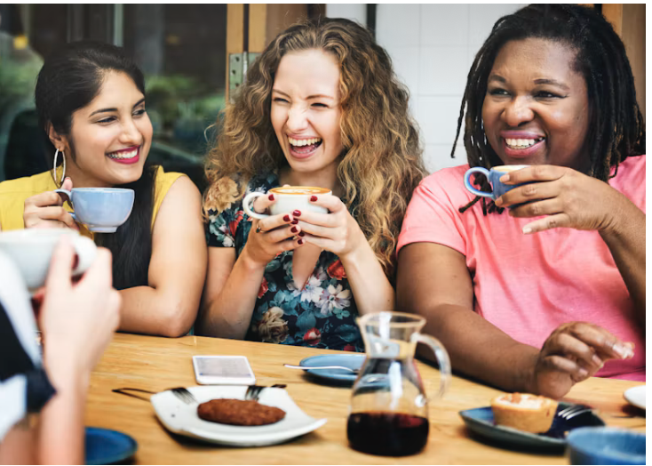
Merri is a small cupcake business turned nonprofit community cafe that seeks to end the loneliness pandemic in the UK. They are on a mission to partner with local mental health organisations to create more third spaces for people to gather, connect and find joy in.
SELECTED SERVICE
THE BRIEF
Develop a fresh & grounded brand identity for Merri to better reflect their growth to a non-profit with a huge impact. Increase brand credibility, scalability and professionalism within their perception.
THE SITUATION THEY WERE IN:
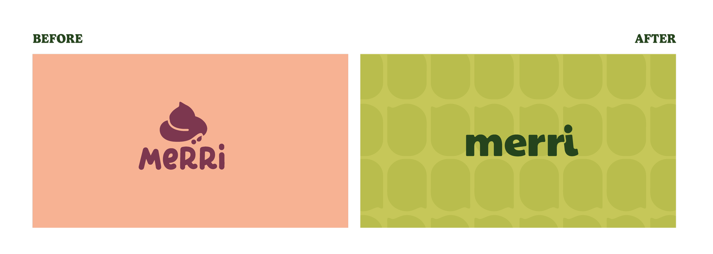
They had significantly outgrown their brand from year 1, which was holding them back from pursuing bigger opportunities
Merri came to me ready for a complete rebrand. They found people weren’t able to grasp the extent of their work and their brand made them look smaller than the impact they were making, which affected their potential for growth & funding.
They also lacked a cohesive system that gave them the confidence to create new marketing material and work with partner organisations without compromising on what they looked like each time someone else took over a design.





THE TASK
What outcome were they
hoping to achieve?
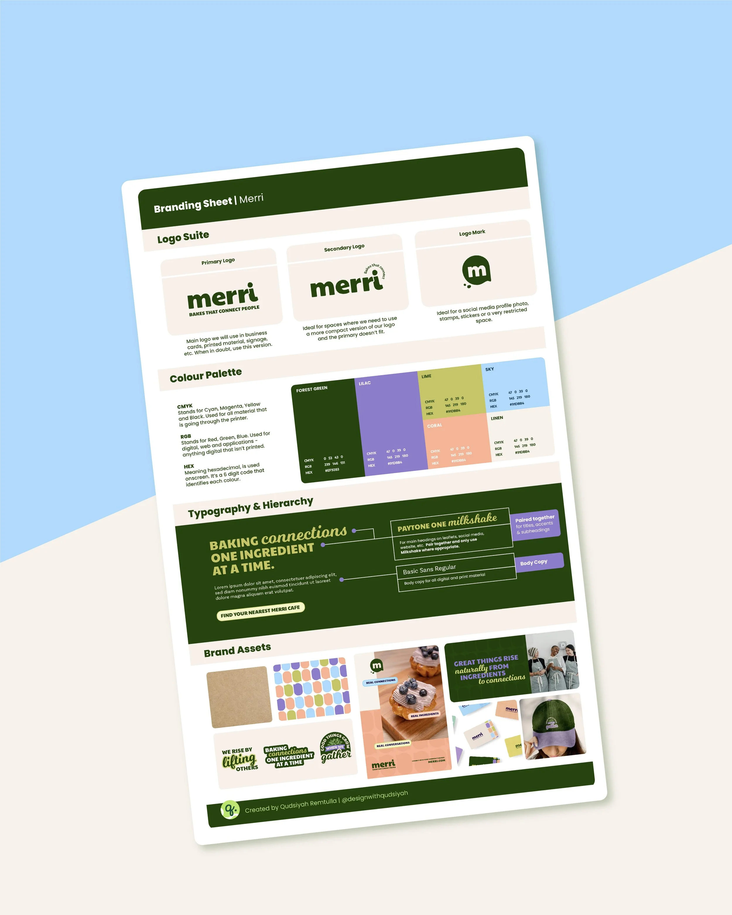
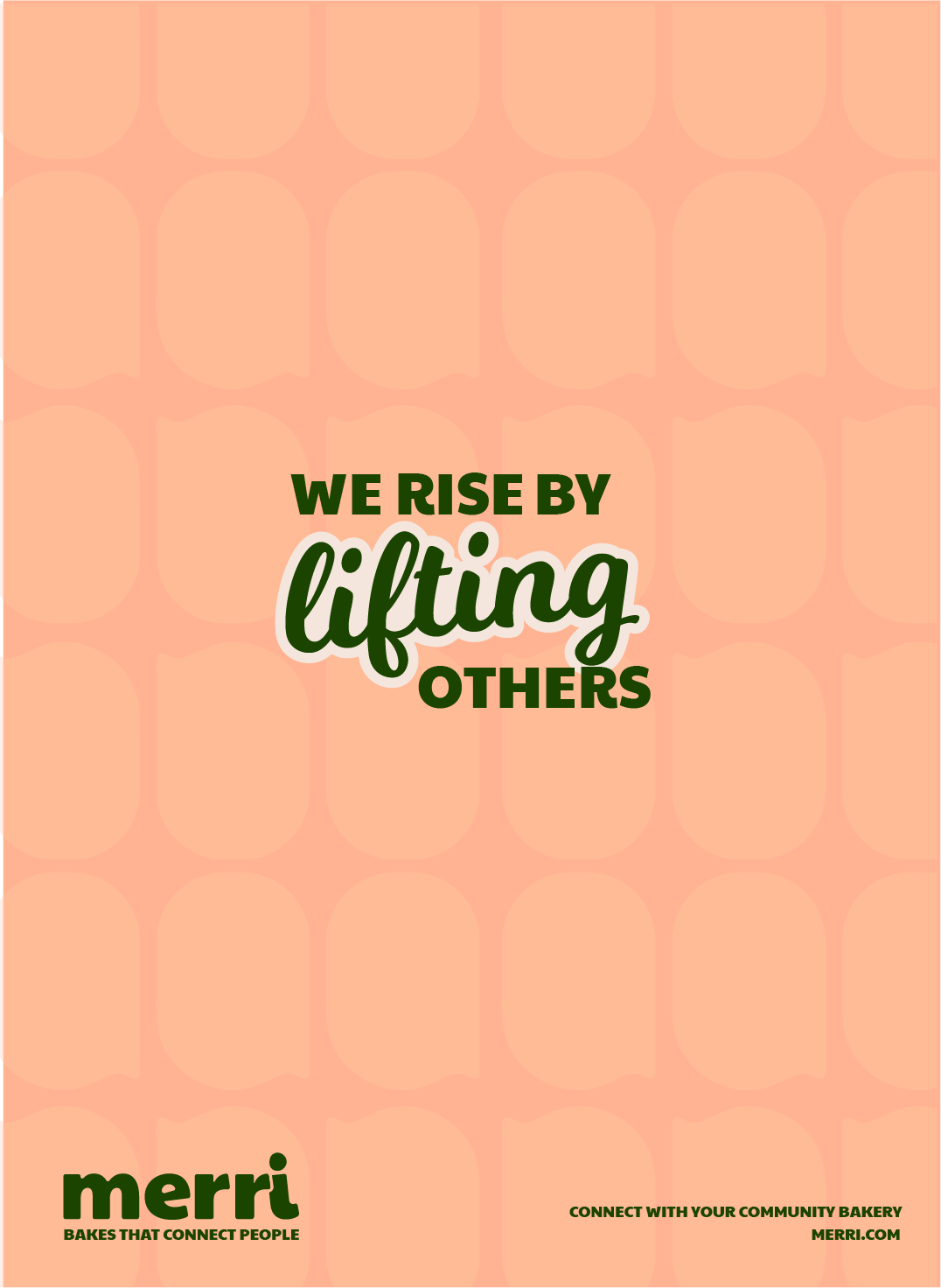
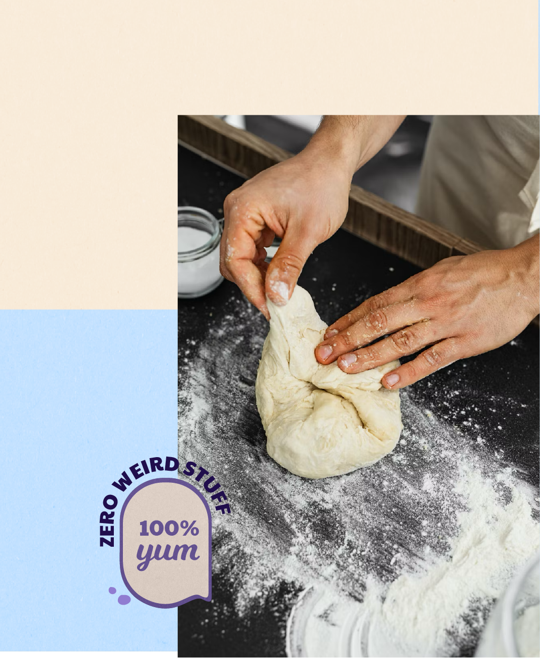
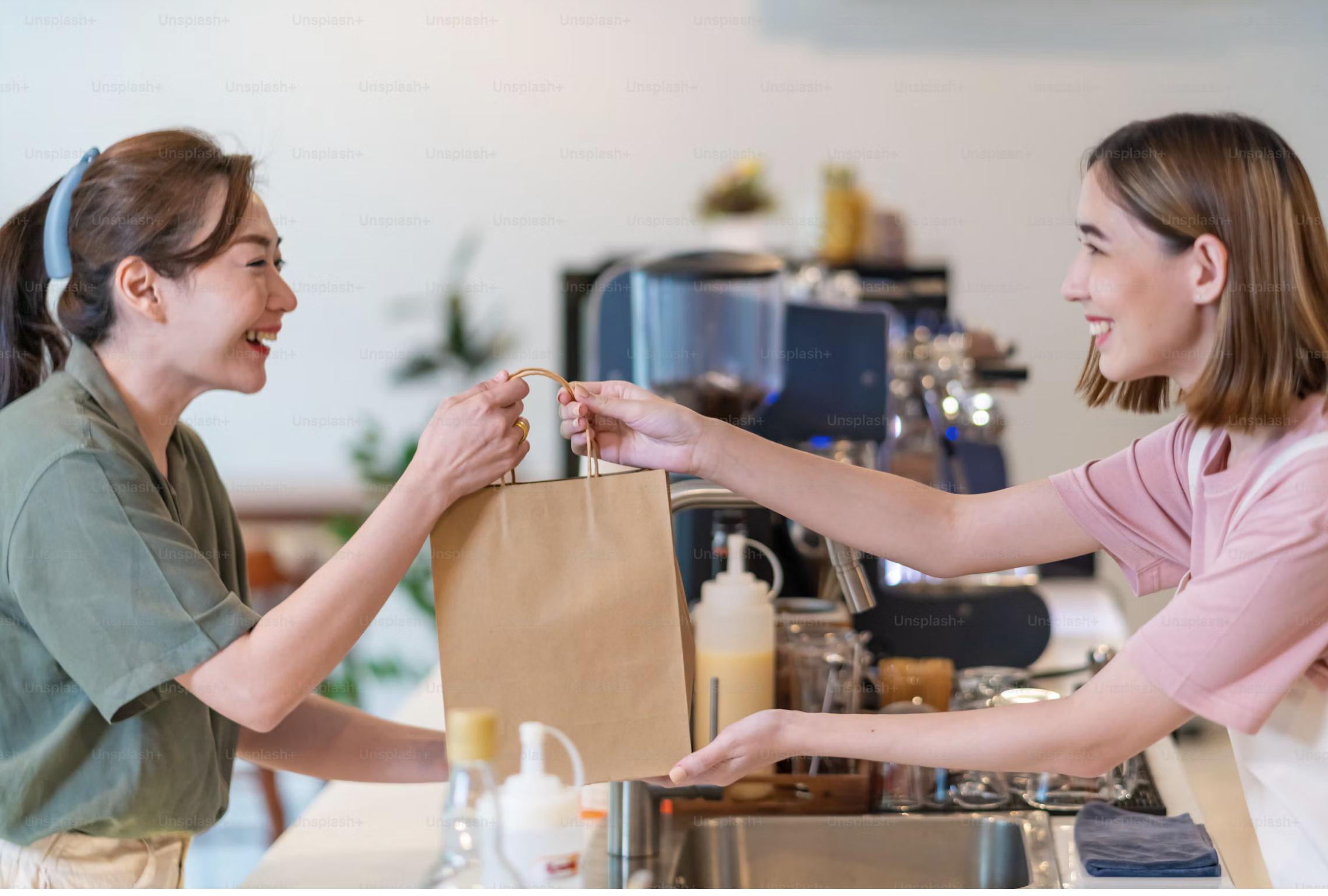
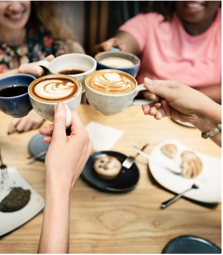
Merri wanted their new brand and space to better reflect their growth in impact and something that would resonate with a range of ages. The goal was to craft an identity that felt like meeting an old friend but in a fresh environment - familiar, cosy but fresh. Their new brand pairs vibrant colours with a grounding forest green colour, brought to life with illustrations and community messaging, feeling personal and resonant throughout.

THE ACTION
What steps were taken to
meet their goals?
As part of the brand leap service, I re-imagined Merri’s identity from the ground up, undertaking research to better understand the nonprofit space, spot common patterns and identify the gaps they could take up.
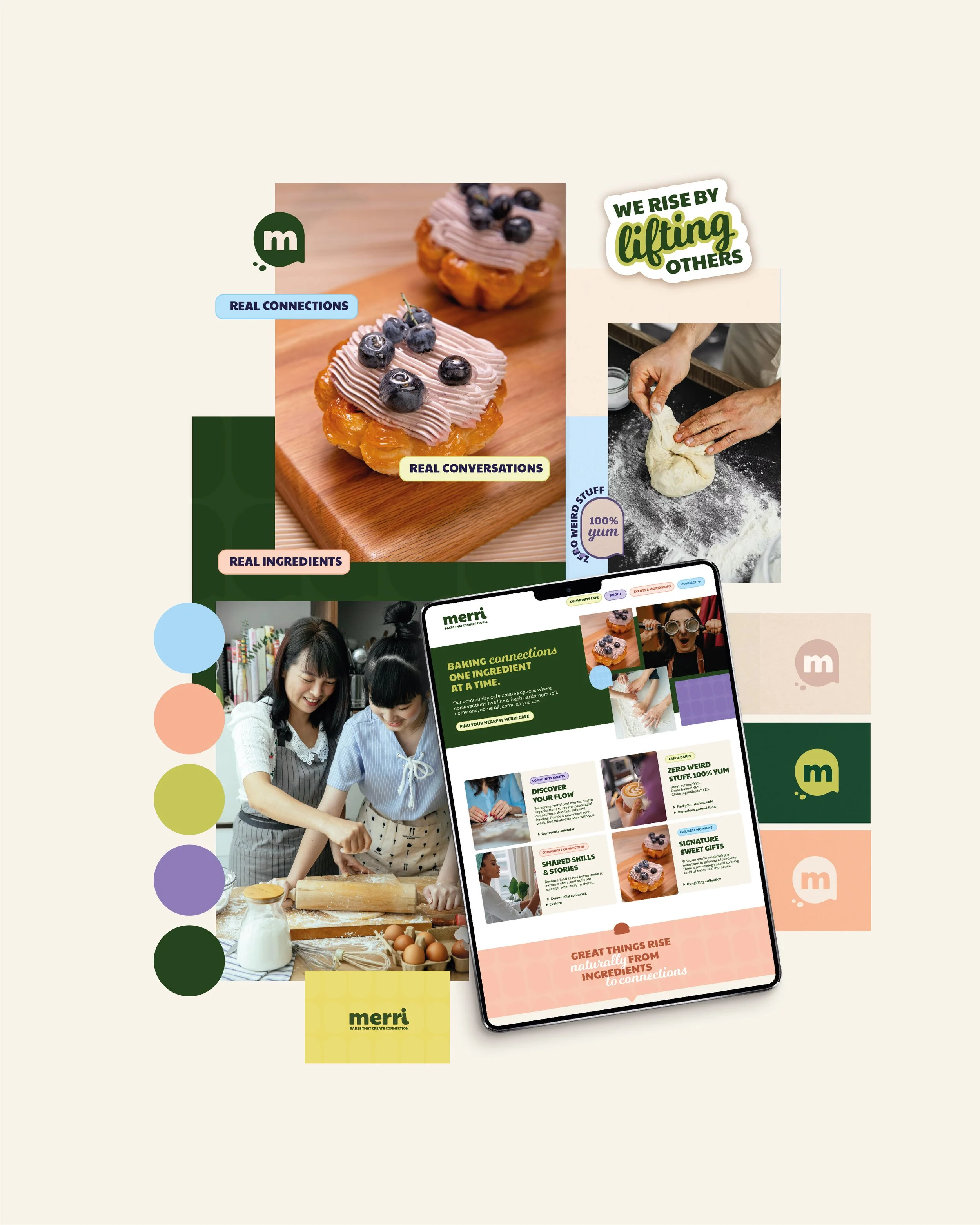
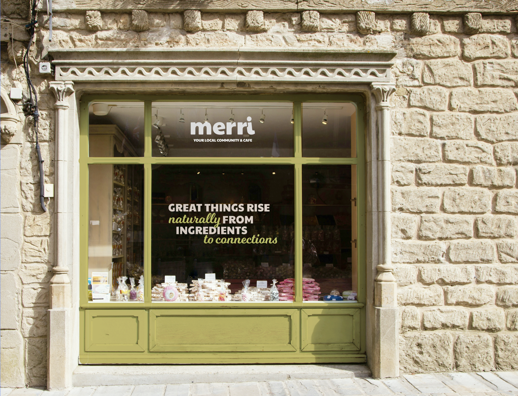
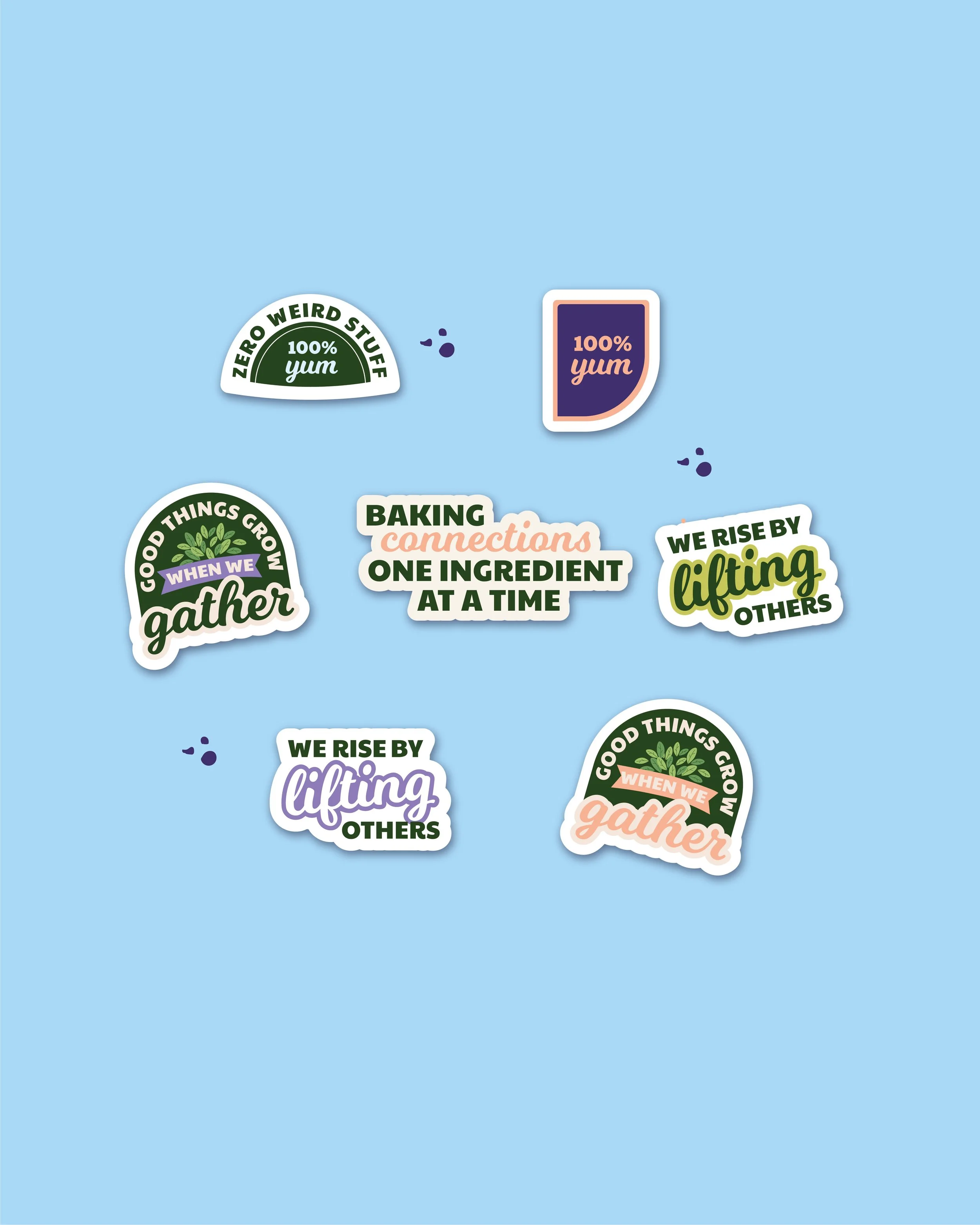
With the choice of colours, a simplified word mark logo and charming illustrations, each element was intentionally chosen to reflect the gentle vibrancy of connection to create something that felt rooted, yet refreshed. We then carried this visual system through the website, social media and marketing material, designed to feel open, calm and fresh with each interaction.


THE OUTCOME & IMPACT
What was the end result?
A grounded brand identity that strikes a beautiful balance between playfulness, excitement and professionalism. With a new logo, a fresh colour palette, brand patterns and community-centred stickers, Merri is the space to meet like-minded people, feel a sense of togetherness and contribute to something greater.